Spirited Selections
“Spirited Selection” is a seamless, intuitive app and responsive website for an alcohol retailer, ensuring a cohesive user experience across all devices.
Responsibility’s
User Research
Interviews
Wireframes
User Personas
Mock ups
High Fidelity Prototypes
Client
Coursera Project
Year
09/2024 - 11/2024
My role
I worked on this project solo.


Goal
Our goal is to create an app that simplifies the world of beverages. By providing detailed product descriptions, expert tasting notes, food pairing suggestions, and engaging educational content, we empower users to make informed choices and discover new favorites.
Problem
Selecting the perfect drink can feel overwhelming, whether you're a curious newcomer or a seasoned connoisseur. The lack of detailed product insights and accessible educational tools often leaves customers uncertain and uninspired in their choices.
User Research
We listened. Through user interviews and a comprehensive competitive audit, we uncovered key frustrations about ordering alcohol online—users felt overwhelmed, uninformed, and disconnected from the experience. Our research revealed that customers weren't just seeking a quick purchase; they craved opportunities to learn, explore, and discover. These insights inspired us to pivot, incorporating personalized recommendations and interactive features to transform the process into a seamless and engaging beverage journey.
Pain Points
1
Selection Overload
The abundance of spirits on the market creates a significant challenge: decision paralysis. Users, particularly those new to the category, struggle to navigate the vast selection and make informed choices.
2
The lack of flexible delivery and pickup options presents a significant obstacle. Users often encounter inflexible schedules and limited choices, hindering their ability to receive their orders at a time and location that suits their needs.
Information Gap
3
The lack of interactive elements creates a less engaging experience. Users may feel disconnected and miss the social aspects of in-store purchases, such as personalized recommendations and the opportunity to discover new products through interaction with knowledgeable staff.
Lack of Interaction
4
Inflexible delivery
A significant barrier to informed choices is the lack of detailed product information. Users are left without the necessary information on tasting notes, pairings, and brand stories to make confident selections.
Persona

Amanda King
Age: 32
Education: Degree in Marketing
Hometown: Charlotte, NC
Family: Single
Job Title: Marketing Manager
Goals
Discover unique, high-quality wines and spirits.
Gain more confidence in her selections.
Have convenient delivery or pick-up options.
Frustrations
Too many choices.
Insufficient product details.
Inconvenient delivery options.
Impersonal shopping experience.
Amanad is a marketing manager with a busy schedule, who often hosts gatherings for friends and colleagues. She enjoys discovering new wines and spirits to share, and values brands that educate her on products and male it easy to explore new options. Amanda typically shops online and prefers curated experiences that save her time and enhance her knowledge.
“I want an easy way to find the perfect bottle and feel confident about my choice without needing hours of research”
— Amanda King
User Journey Map
From initial curiosity to post-purchase delight this journey map reveals key pain points, such as information overload and a complex checkout process. By addressing these challenges—streamlining browsing, personalizing recommendations, and optimizing the checkout flow—Spirited Selections can create a seamless and enjoyable user experience, fostering customer loyalty and driving repeat purchases.
Persona: Amanda King
Goal: Seamlessly discover, select, and purchase wines or spirits while enjoying personalized recommendations and a smooth delivery experience.

Information Architect

Paper Wireframes

Website
Understanding the importance of clarity, I designed the interface with user-friendliness in mind. Clear calls-to-action and a consistent view of the alcohol options ensure a seamless and intuitive user experience.


Phone
To create a seamless user experience, I maintained a consistent layout across the website with subtle variations in the top navigation. Implementing a burger menu and a dedicated account page ensured a clean and uncluttered interface, enhancing user navigation and overall satisfaction.


Digital Wireframes
After conducting user testing sessions and gathering feedback on my paper wireframes, I identified key areas for improvement to better address user needs. To enhance the design, I added a persistent "Your Cart" section, allowing users to easily track their selections throughout the checkout process. Additionally, I implemented clear indicators for required fields, improving the overall user experience and reducing form completion errors. These insights from early testing guided the creation of more intuitive and refined digital wireframes.
Laptop

Mobile

Low-Fidelity Prototypes
This app follows a hub-and-spoke navigation model, starting from the main homepage. From here, users can explore clearly labeled categories at the top of the screen, ensuring easy discovery. Key actions such as account creation, cart access, and company information are all accessible from the home screen, streamlining the user journey.
Website

https://www.figma.com/proto/mBvNz6Dxesy2hDYtP2KE4z/Spirited-Selections?node-id=0-1&t=0dkv5Tsp7ArQ7Rjq-1
Phone


Usability Study

Moderated usability study

United States, In-Person


5 Participants
10-15 Minutes
Findings
Navigation: Users found it intuitive overall, but returning to the homepage after order confirmation was not as clear as expected.
Persistent Item Display: Reassured users about their selections, though some found it visually intrusive.
Order Confirmation Page: Perceived as lacking sufficient details about the order, leading to uncertainty.
Favorites Feature: Users expressed interest in the ability to save favorite drinks for future purchases.
Before & After: Usability Improvements

Before usability study


User feedback revealed a need for an enhanced confirmation page. In response, I updated the layout to better reflect the brand identity and included key order details such as cart information, support links, and confirmation numbers. This enriched the post-purchase experience and provided users with the necessary information and support. Furthermore, users felt overwhelmed by the initial drinks page. I addressed this by reducing visual clutter and incorporating whitespace, creating a more focused and easier-to-navigate experience.
After usability study

Responsive design in action
Website


Phone


Website


Phone


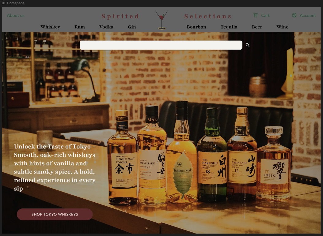
In my design for the Spirited Selections app, I used a modern, sleek aesthetic with dark tones and high contrast to create a bold and sophisticated look. The layout is clean, with a focus on easy navigation to ensure a smooth browsing experience. The typography is clear and legible, complementing the app’s high-end feel while making the content accessible to all users.
Mockups

Website

Mobile
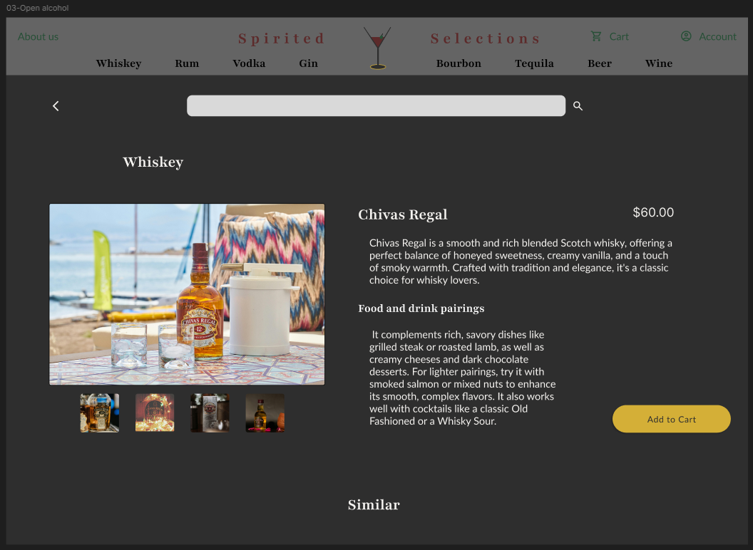
High-Fidelity Prototype
In my high-fidelity design, I focused on making navigation as clear and intuitive as possible. A heart icon next to alcohol choices allows users to quickly add favorites, enhancing convenience. On mobile, the account page is a dedicated screen for a streamlined experience, while on the website, it is integrated with the alcohol selection. This allows users to keep their account open while browsing, reducing friction and improving multitasking.

Website
Mobile

https://www.figma.com/proto/mBvNz6Dxesy2hDYtP2KE4z/Spirited-Selections?node-id=16-216&t=0dkv5Tsp7ArQ7Rjq-1
Accessibility Considerations
All images, including product visuals and interactive icons, feature descriptive alt text to ensure accessibility for users with screen readers.
The design incorporates large, legible fonts and high color contrast for optimal readability, ensuring accessibility for users with visual impairments or color blindness.
Clear and concise heading and subheading labels enable screen readers to easily navigate the page, enhancing accessibility for visually impaired users.
Takeaways
Impact
This sleek and sophisticated app enhances alcohol discovery by providing detailed tasting notes and expert food pairings. Users can refine their palate, make informed choices, and confidently explore new selections. Whether a novice or connoisseur, the app offers a deeper understanding of flavors, elevating the appreciation of each drink.
What I learned
This app, developed as part of my Coursera course, was a hands-on opportunity to apply design principles in a real-world project. I gained valuable insights into the power of user feedback and iterative design, and how aligning design with brand identity enhances both trust and visual cohesion. The project also reinforced the importance of accessibility and usability in creating inclusive, user-friendly experiences. Additionally, I learned how data-driven decisions can refine designs and elevate user satisfaction.
Next steps
Host virtual tasting sessions to gather real-time user feedback and tailor recommendations more accurately. This interactive approach will enhance user engagement and create a more personalized experience.
Integrate an AI-powered search engine to enhance product discovery. This will enable users to quickly find options based on flavor profiles, occasion, or specific preferences, improving usability and ensuring a personalized search experience.
Implement a personalized selection feature to provide users with a more curated experience. This will allow users to easily discover products that align with their individual tastes.